
Rooted
Project Details
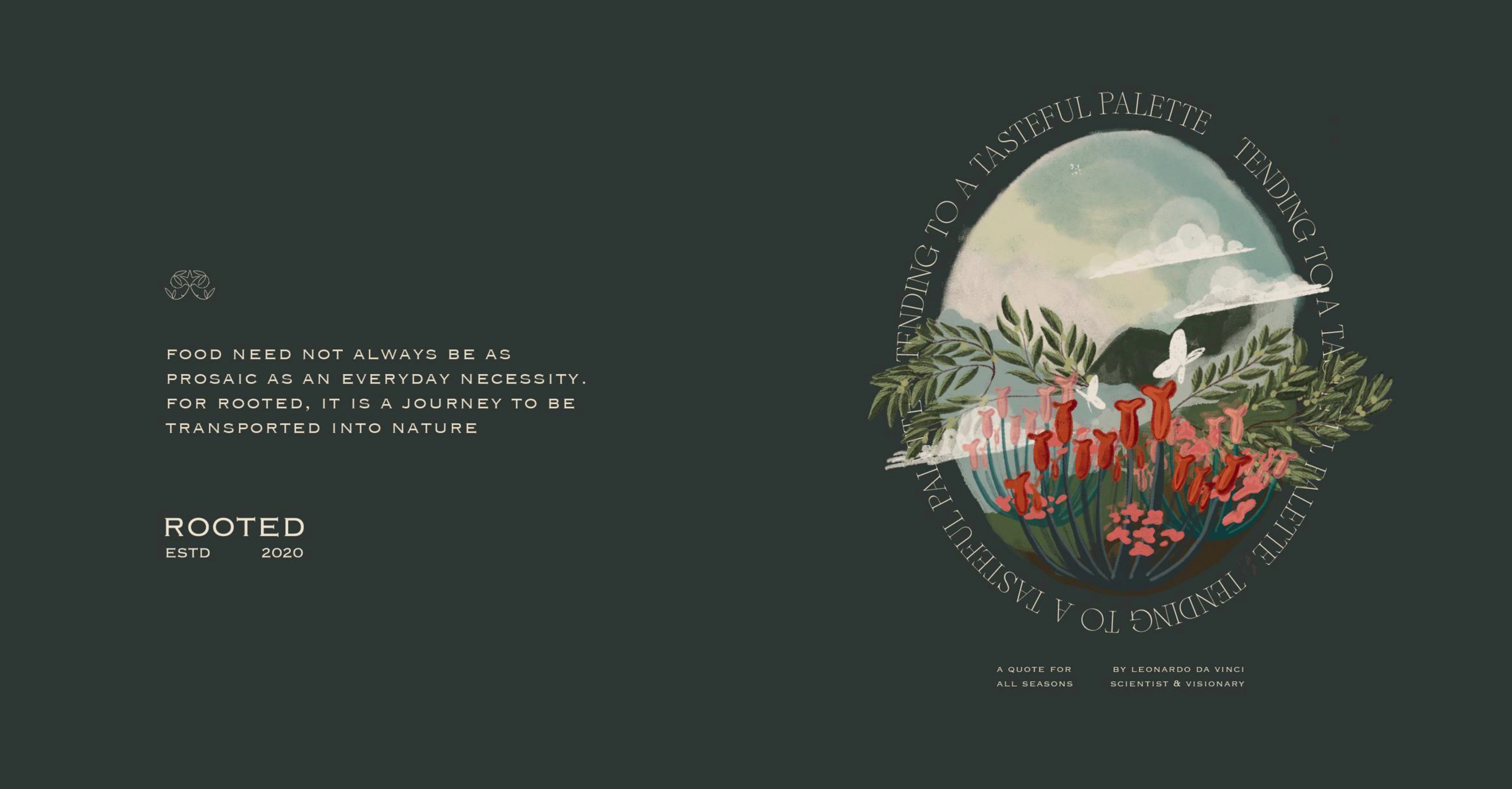
Chic branding for an artisanal food aggregator; infused with an adaptive identity system developed for Rooted’s constantly expanding range of offerings. This identity was further applied to develop the packaging for the brand. An identity that leverages the power of type and Onomatopoeia to create an immersive connection with food.
Year
Client
Agency
Category
Role
Sector
2020
Rooted
The Space At 9/2
Branding & Identity, Packaging Design
Lead Designer
Food & Beverage


The power of type and Onomatopoeia


The sound and shapes of type to tend to a tasteful palette
To help the brand distinguish itself in a highly competitive market, the identity system diverges from the prevalent health and wellness narrative often associated with the 'farm to table' food industry. Instead, it reimagines the act of eating as an immersive journey. This open and adaptable identity employs a diverse range of typefaces to convey the character and multi-sensory gastronomic nature of food. Sharp-crisp-leafy Weekly chop-chop Tongue-tantilizing Sweet & tart Nutty whole wheat


In this collection
