
Drayp Identity
Project Details
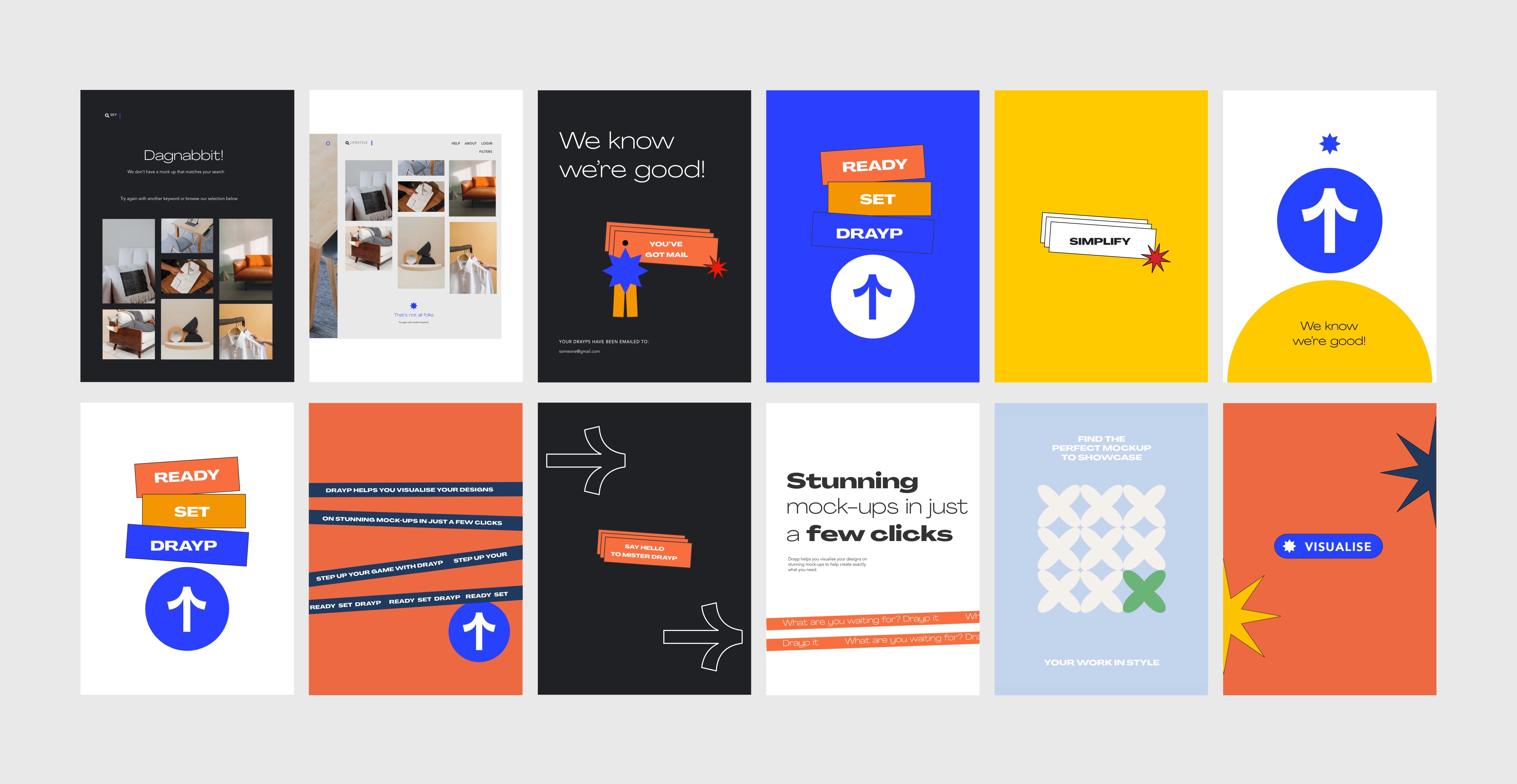
Drayp is an innovative SaaS solution designed to empower businesses with smarter workflows. Drayp offers a time-saving, seamless online platform for effortlessly visualizing designs on captivating mock-ups, streamlining creative processes. It was essential for Drayp to create a demand for its easy-to-use service – through action-oriented graphics, toungue-in-cheek humour and short statements that described what the SaaS product could be used for.
Year
Client
Agency
Category
Role
Sector
2021
Drayp
The Space At 9/2
Branding & Identity, UI-UX, Product Design
Lead Designer
Software as a Service


To spark a vibrant sense of creativity with its playful and energetic design elements.


Mr. Drayp(s) — personified to create an emotive connect between the user and the tool, making them feel as if they're constantly assisted and not left alone with a new, intimidating technology.


Improve workflows and visualise designs on to everyday objects
Our study indicated that the target audience for Drayp were individuals who either were not accustomed to using softwares to mock up their works or found it to be a tedious process to do so. For either category, it was essential for Drayp to create a demand for its easy-to-use service – through action-oriented graphics, toungue-in-cheek humour and short statements that described what the SaaS product could be used for. Hence, the visual identity and language developed for it was required to be simple and friendly yet knowledgeable and witty — almost as if it was the user’s Right-hand-man. Keeping these factors in mind, the USP, Boilerplate, Brand Voice and Brand Personality was developed; key for decision making for crucial factors for Visual Identity design such as colours, typefaces, animation style, and symbols. Mr. Drayp(s) — personified to create an emotive connect between the user and the tool, making them feel as if they're constantly assisted and not left alone with a new, intimidating technology. Along with the playful persona, the catchphrases developed for Drayp were meant to clearly state the purpose of the product but with all the fun & charm, for better recall and loyalty. The colours are the used with playful measure and is offset by a distinct charcoal and grey that give it the sleek and professional appearance. A SERIOUSLY FUN GRAPHIC VOCABULARY. Although the geometric shapes appear to be simple forms, its use case calls for a playful and purposeful approach. The iconic Drayp arrow is used prominently to bring to attention the action of uploading the files and on CTAs. The star is used for the files to be ‘Drayp-ed. This is done to ease users to get comfortable with a new yet resourceful tool and encourage them to use it in their everyday workflows. Agradir is a sans-serif family that has several weights, is easy on the eye, and attractive – which made it a perfect choice for us to use it for the identity developed for Drayp. It’s need to be purposeful on a user interface as well as social media fit in perfectly with the overall personality set for Drayp. The colour palette was distinguished for use on social media and the web-based product. A striking blue was incorporated for action-items and CTAs
Action-oriented graphics, toungue-in-cheek humour

In this collection

